





















Insight
Why new households leave in the first 90 days
Learn how banks can improve customer onboarding, detect early attrition signals and turn new accounts into active, long-term household relationships.
The irony is that every institution already has access to the data. UBPR benchmarks, call report comparisons, regulatory peer group rankings; the raw material is standardized, public, and sitting there. Most executive teams have seen the reports. Most can tell you where they rank on Net Interest Margin or Cost of Funds. What most cannot tell you is why the gap exists, whether it matters, or what to do about it.
The availability of data is almost never the problem. The methodology is.
Most of what passes for peer benchmarking for banks is doing almost none of the work it could be doing. Peer groups get assembled, ratios get pulled, and someone presents a slide showing the bank is within range on NIM and Cost of Funds. The room nods. The box gets checked.
That is a legitimate governance exercise. Knowing where you sit relative to peers has real value. But that macro picture is only half the story, and it is the less actionable half.
The standard peer report is not built to explain the gap. It tells you that your net interest margin is 15 basis points below peer median. It does not tell you whether that gap reflects a strategic choice, a structural disadvantage, or an addressable problem. Benchmarking that only confirms you are different — without identifying why — has satisfied the reporting function and missed the diagnostic one.
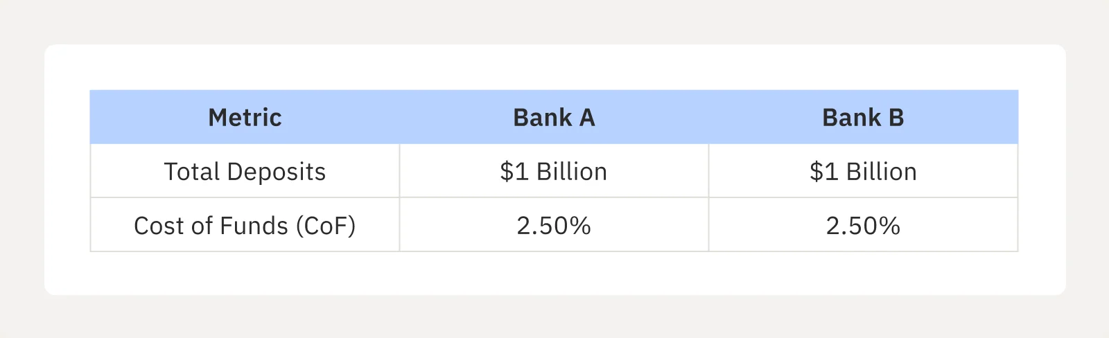
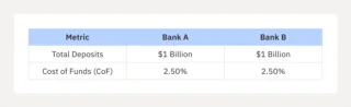
Here is what that gap looks like in practice. Two banks, same total deposits, same reported Cost of Funds:
On paper, macro bank performance comparison says these institutions are perfectly matched. Under the hood, the reality is completely different. Bank B’s CoF is driven by relationship depth — hundreds of households using it as their primary financial institution, with checking, debit, and loan relationships keeping balances steady. Bank A’s CoF is propped up by a smaller group of high-balance, single-product CD accounts.
The aggregate number looks identical. The funding stability is not. If rates shift, those concentrated CD balances are more likely to reprice or leave entirely, and that risk is invisible in the standard peer comparison. The problem is not the data. It is the layer of analysis that was never applied to it.
The standard methodology for constructing peer groups draws on three variables: asset size, geography, and charter type. These are straightforward to pull from public regulatory data, which is exactly why they are so widely used. They are also genuinely insufficient as a basis for meaningful comparison.
A CRE-heavy bank and a diversified consumer lender can sit in the same peer group and share almost nothing operationally. A bank running primarily on wholesale funding and a bank built on core retail deposits look identical in the asset-size filter. The peer group says they are comparable. Under stress, they behave nothing alike.
Strategic peer group selection banking requires looking beyond basic asset filters. True peers behave similarly under pressure because they share identical structural DNA:
The right question is not “which banks are roughly the same size?” It is “which banks make the same kinds of decisions under the same kinds of conditions?”
I have worked with institutions that spent years benchmarking against groups that consistently made them look average, when the right peer set would have told a completely different story. In some cases they were significantly outperforming. In others, a real gap was being obscured. Either way, the standard peer group was not doing the diagnostic work they thought it was.
ROA. NIM. Efficiency ratio. These are the metrics most peer comparison reports lead with, and they are the least useful for diagnosis. They are outcome metrics: they tell you what happened. They do not tell you why, or what to do about it.
Net interest margin is a good example. I have worked with institutions that consistently outperform their peer median on NIM and are not growing. Others underperform NIM but carry a deliberate lower-rate deposit strategy that produces better long-term retention and lower funding volatility. In both cases, the NIM figure without context is not a signal. It is a number.
The metrics that expose the gap are the drivers behind the outcomes. Specifically:
High-performing banks do not track more metrics. They connect the ones they already have. Outcome metrics describe where you are. Driver metrics explain how you got there. Leading indicators tell you where you are going. A benchmarking framework that layers all three is a substantially different tool from a report that shows rankings.
The shift I have seen in institutions that use benchmarking effectively is a framing shift, from report to diagnostic. The peer comparison is not the endpoint. It is the question generator.
A gap in Cost of Funds relative to a well-constructed peer group is not a finding. It is the beginning of an analysis. Is the gap driven by deposit mix? Pricing strategy? Market positioning? Each of those has a different remediation path. Until you trace the gap to a balance sheet decision, you have not benchmarked. You have only measured.
The framework that works moves through four steps:
Once peer data is used that way, it changes the culture of the planning process. It removes the opinion-driven dynamic where the loudest voice wins the budget. It replaces “How did we do last quarter?” with “What do we actively target next quarter?”, and it gives that targeting a factual basis rather than an intuitive one.
Gaps are not bad. Unexplained gaps are. That distinction is what peer benchmarking is actually for.
Peer benchmarking for banks is standard practice at almost every community institution in the country. The reports are produced, reviewed, and filed. What is less standard is using the output as the beginning of an analysis rather than the end of one.
The data is not the limitation. The methodology is. A well-constructed peer group with the right driver metrics will surface gaps worth closing and advantages worth protecting, but only if the right questions are being asked of the right comparables.
The peer report confirms where you stand. The peer analysis tells you why. Those are different capabilities, and the difference compounds over every planning cycle that runs without one of them.

Learn how banks can improve customer onboarding, detect early attrition signals and turn new accounts into active, long-term household relationships.
Learn how customer segmentation and peer data help banks identify high-propensity households, improve acquisition and deepen customer relationships.
See how peer data and the penetration gap reveal your bank’s true market position, relationship depth and untapped opportunities for growth.